February 8, 2024
From design to code
Since 2020, we at Factorial do not only offer web development, but also conception and design for all kinds of web projects. And while in the past designing and developing websites has usually been a quite separate process, there are nowadays powerful tools for cooperation between designers and developers. At Factorial we try to make use of these tools as much as possible.

Designing in Figma
Our designers work with Figma, a web-based design tool developed for easy collaboration with developers. We will show later how we actually make use of that, but for now let us have a look at how we structure the projects.
Usually we create five so called “Pages” in Figma:
- Design Tokens
- Elements
- Patterns
- Template components
- Templates
Design Tokens
Design tokens are a set of styles — colors, typography, size and effect variables that are used across the product — to create a consistent and simple design language.
On the Design Tokens page, we create four different art boards: Colors, Typography, Spacings, Other
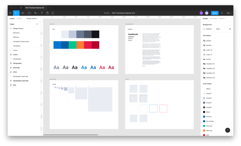
Colors can contain colors for typography but also decorational colors. It is important for us to separate these two to make sure that certain colors should only be used for certain things. E.g. a light grey might be good for background or an outline, but not good for typography as the contrast ratio could fail, especially for visually impaired users.
Spacings contain a list of pixel based spacing values (which will later be converted to rem in CSS), usually starting at 4 and containing not more than 8-10 values.
Typography lists all different types of text styles: headlines, copy, highlighted text, links and so on.
On Other we define values for elevation, borders, radiuses or certain effect styles needed for i.e. hover effects or overlays.
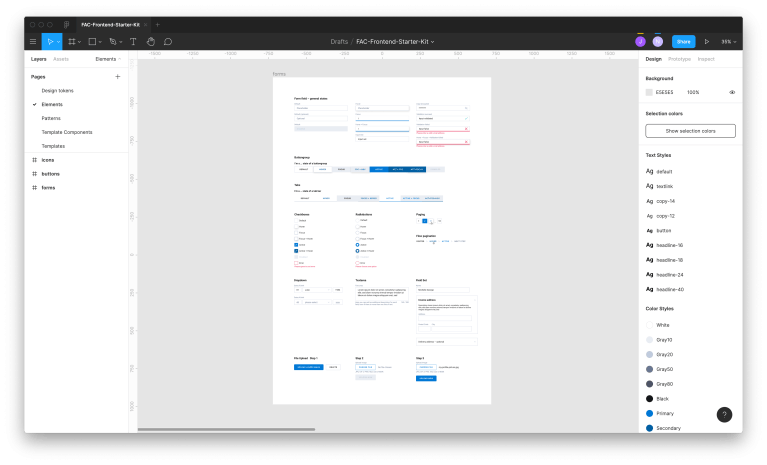
Elements, Patterns, Template Components and Templates
The pages Elements, Patterns, Template Components and Templates are where the actual designs are located.
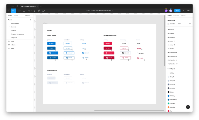
On Elements we have small components which can be reused everywhere. These are usually components like buttons, icons, form elements, images, etc..
Patterns are combinations of elements, but not only. They are rather complex components like an image gallery, rich text, a slide show and so on. These components can later be picked by the editors of a CMS to compose the content of a website, e.g. using Drupal’s Layout Builder.
Template components are the single parts of a template: header, footer, navigation, search results, sidebar etc.. These elements can not be picked by editors, but are instead a fixed part of templates.
Templates bring everything together: They connect template components and patterns and represent completes pages like a homepage, product page, search results, etc..
Importing design tokens via Figma API
When naming pages, art boards and tokens in Figma, it is very important that we follow a certain structure and naming convention. Not only does that make communication and reusability easier, it also allows us to use the Figma API to import our design tokens and components directly into our projects.
Our frontend stack, which is part of every new project, contains a small script, which lets us do exactly that. When executing it, it will use the Figma API to connect to our Figma file, receive a JSON response containing all the necessary information about the designs and then create
- a tokens.css file, which contains CSS custom properties based on the Design Tokens page in our figma file,
- empty components based on the other four pages.
The custom properties are named accordingly to the design tokens in the Figma file. This makes sure that designers and developers talk about the same things and it simply makes it easier to remember how things are named. Since this file is auto-generated, it should never be changed manually. As soon as we run the import again, this file would be overwritten.
For elements, patterns, template components and templates, the script creates empty components in the same hierarchy. If the Figma file e.g. contains a button component on the Elements artboard, it would create:
It would only do that if this component does not exist yet to avoid overwriting components, which have already been implemented.
While the button.css and button.twig (twig is template language of our choice) are part of the actual component, the mocks.yaml and schema.yaml are important for collaboration with backend developers and for our component library.
Developing in miyagi
After having used Pattern Lab for many years, it met our requirements as a component library less and less. It is a proven, well-working tool, but it started feeling too heavy and too slow for us. We also had increasing needs, which our component library should fulfil and Pattern Lab was simply not able to do that. After evaluating lots of different tools and not being able to find just one tool which would be able to deliver everything we need, I ended up creating a tool myself to serve that purpose. It is called miyagi.
miyagi is a node module, using an express server and can basically fit to any project structure you have. You can name your folders and components any way you want, nest them as deep as you want, use (almost) any kind of JavaScript templating language and all it needs in your project is one configuration file (it actually even works without a configuration file by trying to guess your template language, but you need to follow a certain naming convention for your folders and components then). This allows us to use it in different kinds of projects while keeping the project structure completely independent from our component library. If we ever want to use a different one, all we need to do is remove the configuration file.
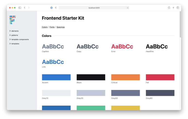
Design tokens
When you open the start page of a miyagi instance, you will get a representation of our design tokens: miyagi is able to parse our CSS files, look for custom properties with a certain naming (which we get out of the box thanks to our token importer) and create a nice overview of all design tokens we have in a project.
Customer theme
miyagi can also be styled in the CI of our customers: fonts, colors, a logo and basically any CSS can be added to give the customer the feeling that it is their component library.
The schema files
The schema files are JSON schema files. We use them to agree on a certain data structure for a component, to make sure that the provided data by a backend service actually fits to that component. But they also allow our designers to come up with certain restrictions, e.g. a given text should only be 200 characters long etc..
While these schema files are independent from a component library, they are still used by miyagi to validate the mock data: If the given mock data for a component does not fit to the given JSON schema, it will render an error.
The mock files
One aspect of component libraries is usually that they allow encapsulated and indepenent development of components. This means that frontend developers can build a component without having to wait for a backend service, which provides them data or an environment to render this component.
To do that in miyagi, we can create mock files to provide dummy data for our components. This can be static using yaml or json, but you can also use JavaScript files, which asynchronously export data coming from some API, for example. That way we can have many different variants of a component to make sure that the components always work, no matter how the data which is passed to the component looks like.
Based on these mock files, miyagi creates a separate view for every variant. We use these views also for our visual regression tests.
Testing for visual regressions using our component library
To make sure that we do not accidentally create visual regressions, we use BackstopJS to test our components (including all elements, patterns, template components and templates) for exactly that.
The way this works is that when creating a pull request in our git repository, we first create a static build of our component library (which will later be deployed to a dedicated instance, so everyone can have access to that: designers, developers, project managers, the client, …) and then use these static build files to compare them with the previous ones (which are checked in to the git repository).
That means we have a direct coupling between our component library and our visual regression tests and are not depending on some third party services: there won’t be any downtime and nothing leaves our servers.
Starting projects with the Frontend Starter Kit
Last but not least, we tried to make things even easier, even more consistent and therefore even better and stable.
Since websites do quite often consist out of the same (or at least very similar) components, we came up with the Frontend Starter Kit, which is basically made of all of the above:
- a Figma file which contains accessible colors, typography, components like form elements and so on
- web components for form elements and other recurring components, which are published as node modules
- a Drupal theme providing form elements and other types of components
- all developed and tested for visual regressions using miyagi
This Frontend Starter Kit works for many different types of projects and since we publish the components as node modules, we can even use them in Vue projects.
Overall this allows us to have a standardized, well-proven and consistent base for all our projects, avoiding the “stupid” work which every project contains and letting us concentrate on the rest.