February 27, 2024
How to approach UX and UI Design
There are numerous web pages out there giving advice for what to consider when talking about good user experience and meaningful user interfaces. It actually got to the point where it is hard to wrap your head around all the different opinions existing out there. With this article we try to focus on the essential aspects to provide a comprehensive approach towards good UX/UI design for your web projects.
Why is UX and UI important?
Quite a lot of online sources mix the terms user experience (UX) and user Interface (UI). Often they refer to the same things, get twisted or describe something different than what they actually are. The user experience includes everything that contributes to the experience a user has when interacting with your website. This not only includes the actual perceptions and reactions the users have when and after visiting your web service but also the expectations they might have in advance. With that being said it’s becoming quite clear that UX does not only involve the website’s usability as stated by many sources. It is also crucially affected by accessibility, the utility of the functionalities and the visualisation of the presented content — the user interface. UI therefore is very closely linked to UX — and vice versa just as much.
Now why is good UX and UI important? To answer that, maybe we just emphasize what happens with bad UX and UI in place. A bad user experience is characterized by a couple of aspects. Firstly: The user can’t find what he/she/they initially started his/her/their search for. With that we don’t mean that the website is not offering the service or product requested, but the user have troubles getting there. This happens for example due to bad navigation, accessibility issues, and an inefficient web structure. Secondly, while not achieving the desired goal, the user gets unsatisfied and leaves. Having this in mind, we can conclude that a bad user experience leaves a bad impression on the user. What that means for the website owner is quite obvious: when the user leaves without finishing what he/she/they started, there is no purchase, there is no interaction with the web content and there is no chance the user will come back soon. Hence, there is no revenue generated for the company.
The key question here is: How do we tackle this in order to provide a great experience for the user? There are many different approaches for this and there is no general solution. However there are essential things to consider when working on UX and UI, so let’s dive deeper into the different approaches before we present to you what we think is important.
Different guidelines in discussion
There are dozens of approaches for UX and UI. But for now we’d like to extract aspects from different sources and bring them together to provide a more comprehensive approach. First let’s quickly sum up the principles we build our ideas upon:
- Gestalt Principles: Developed by German psychologists in the beginning of the last century. These principles aim to provide a common understanding about how the user perceives the visual elements of a website. These principles rely on certain capabilities of our brain to recognise and identify shapes and objects, even in a rudimentary form. It adds elements from familiar objects to the visible or sees through a change of perspective in terms of rotation and scale.
- Golden Rules of Interface Design: With the Golden Rules of Interface Design, established in 2016 by Ben Shneiderman from the University of Maryland, a modern touch is given to the considerations about user Interface design. It puts the user into the center and sets a couple of ground rules for the interaction between user and web application.
- Usability Heuristics by Nielsen Norman Group: Rather than putting his finger on specific guidelines to emphasize usability, Jakob Nielsen takes one step back and takes a more holistic approach towards interaction design.
- Other Design Approaches*: To give a practical note to this article we reference a group of other articles that, from our perspective, contain some valid points for the optimal way of engaging in UX and UI design.
The key essence of these guidelines
In the following, we break down the essential aspects of user experience design and user interface design. The following examples should provide some inspiration on what the design can actually achieve to catch and guide the user’s attention. In order to understand how, we will also touch upon a couple of aspects to describe how the user actually perceives certain elements and objects.
- Hierarchy: In order to provide the best possible orientation for the users, web services need a clear structure. Sure, it is one of the more obvious aspects to touch on but nevertheless one of the most important ones, too. By providing a clear hierarchy that guides through your web application you ensure a smooth navigation and make the user finding his/her/their way to the desired content easily.
- User control: Never forget that the user is supposed to be sitting in the driver seat. What does that mean? That means that users should be supported by giving them orientation where they are currently located on the web application and how they can manage their way back and forth. In addition to that, by enabling shortcuts and other ways of speeding up the interaction, more experienced users have the possibility to get to their destination faster.
- Accessibility: Users have different ways of using web content. By saying that we don’t refer only to those user groups that have special needs due to impairments of any kind. Accessibility extends its impact to several types of devices, technical affinities and technological conditions. So make sure to get everyone involved no matter what restrictions are present.
- Consistency: There is nothing more unappealing than confusing your user with inconsistent interactive elements. Relocating buttons and other elements that crucially contribute to the user journey is something you should not even start with. Giving the user an easy-to-use and returning set of interaction patterns is one of the first steps when wireframing web applications. Set this tone in an early stage to avoid complex workarounds and misled user attention.
- Responsiveness: Making your web application responsive doesn’t necessarily mean providing responsive images to play out the system reasonably with all possible devices. There is more than that! The point is rather to make your system actually respond to the interaction of the user. What does that mean? Well that means providing feedback to every action the user carries out, whether it refers to the security level of a inserted password or the misspelling of a crucial information request. Even the slightest reaction from the system telling the user that his interaction was successful is bringing him/her/them closer to feel comfortable and understood.
- Simplicity: Keeping it simple should be one of the main concerns a UX designer should have. Make sure everything has a purpose and supports the user in his interaction with web content. Don’t tease or promise with what you can’t live up to. And don’t distract the user by overloading the content with additional elements, buttons, paths and lists that divert the user from the goal. This is especially important because the human brain is not capable of keeping in mind numerous elements, impressions and instructions. Actually, the American psychologist George A. Miller found out in the 1950s that we are able to remember 7 chunks at a max for a short time, but not more. So let’s focus on not overloading our users.
Spotlight on 3 aspects
Locality
This approach sums up different principles that deal with the localisation of elements. Arranged closer together, these objects convey the impression of having a thematic reference other than objects being separated visually. As a consequence, bringing certain elements closer together supports the communication of similar information and groups content that is related to each other. This pattern can be applied everywhere on your website — always where elements act in a complementary way. An additional aspect to that is provided with the accumulation of elements in a pre-defined area which creates a highlighting-effect that amplifies the presented content. This can be achieved by using different elements arranged together, including the use of colours, lines, shapes and shadows.

Movement
Elements can convey a lot with indicated movement or at least the idea of being in motion. Following this approach, elements that are for example arranged to head in the same direction, make the user feel they are related to each other. In this case the distance between the objects can be neglected. Applied correctly, this helps to lead the user’s attention to certain features and thus demonstrates its benefits especially in product sliders and other movable elements. Another thought added to that lies in the alignment of elements in a straight line or in a shape that gives the eye the chance to follow until its end and therefore provides orientation and guidance to the user. It creates a grouping effect and lets the user follow a predefined path, which is why it can be used in product portfolios, process displays and other listed arrangements.

Appearance
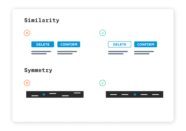
Our mind likes order very much which is why we tend to be addressed by repetitive patterns. For example, when objects are displayed in a similar shape, or likely to look alike due to colour or size, users tend to think these elements are related. Having this in mind it is possible to emphasize certain areas of a website to draw the user’s attention, such as call to action-buttons, headings and links. It also helps the user to navigate through the website. In addition to that our mind reacts to symmetrical elements with the feeling of stability and connectivity which is why content that is arranged in a symmetrical order helps us to focus and navigate. Nevertheless asymmetrical interjections can provide relief from an overly symmetrical and thus boring and predictable structure which is why a rigid adherence to order is not fully pleasing to the user. Make sure to use this information wisely to come up with something unexpected.
Speaking about our brain again, it is to say that it is a marvellous piece of art. It is able to complete figures when they are displayed in fragments, enabling it to convey information with a reduced amount of complexity. The user can grasp important information based on the right hints that are implied. This offers a great variety of possibilities for the design to rely on simplicity and focus on the message. A great way to apply this are icons and other figurative elements.

Wrap up
With this article we aimed to provide a generous overview about aspects we think are important when dealing with UX and UI design. Needless to say these recommendations are related to a very general approach and neglecting the individual case you are trying to provide a solution for. In order to achieve a meaningful user experience, we are asking you kindly to reflect on every information you are reading and every decision you are about to make. Because in the end, everything has to be adjusted to the specific use case. Feel free to get in touch with us to get more inspiration or let us know of your personal experiences.
Additional sources:
https://uxtricks.design/blogs/ux-design/principles-of-design/
https://medium.muz.li/gestalt-principles-in-ui-design-6b75a41e9965
https://www.growth-rocket.com/blog/top-7-ux-design-principles/