User Interface Design
Button Design: Best Practices
A small interface element with a big impact
Author: Annika Fritsch, UI Designer at Factorial
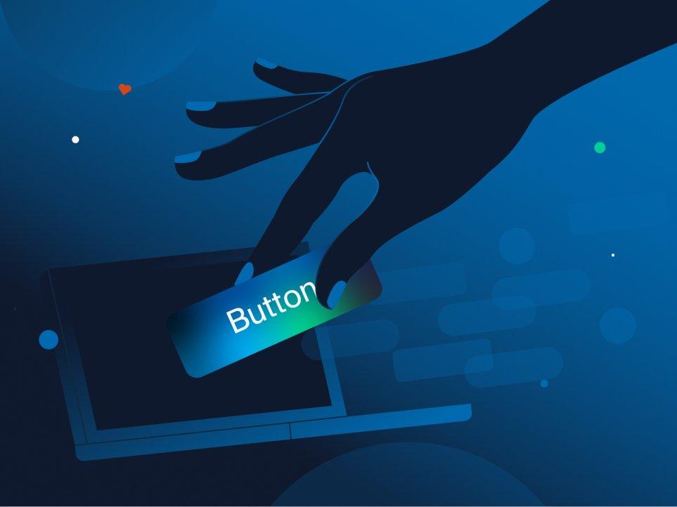
A trivial yet fundamental element in any user interface design is the button. However, the construction and design of a button can be surprisingly complex. But is there even a perfect design for this cool thing? Why is it worth paying so much attention to something so small? Let’s find out what’s the big deal.
What makes a button a button?
Buttons usually refer to any clickable and engaging element on a digital interface, from an actual button and call-to-action to a toggle and a link. It acts as a connection between the user and the digital environment, allowing them to communicate smoothly. We’ve been confronted with buttons in the physical world from an early age. Take a doorbell or a power button, for example. We know that a simple press or click will trigger an action.
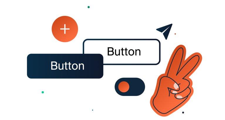
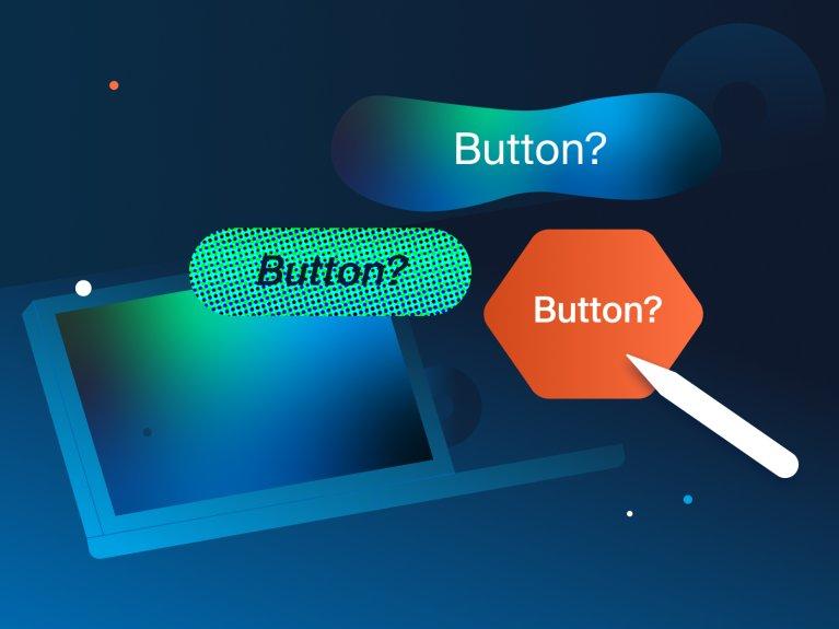
If you break it down, a button acts as a key, a door and a signpost, all at once, to get you to another level, to get you one step closer to the action you want to do or the place you want to be. The most common type of button is a rectangle with a label, called a contained button. But there are far more variations. Below are some of the most popular styles.
User Interface Design: Best Practices for Buttons?
Designing a button doesn’t look too difficult at first glance, but there are a few rules that anyone designing a button should keep in mind.
1. Get the look
Make the button look like a button. Users should be immediately drawn to it. The right shape, size and colour are all important so that it can be found and identified as such immediately. As there are usually several buttons on the site, they need to follow a defined design pattern. It is vital to stick to these patterns in order to keep the use intuitive and to live up to the phrase ‘don’t make me think’. Users should never be confronted with new appearances of a button within the same function.
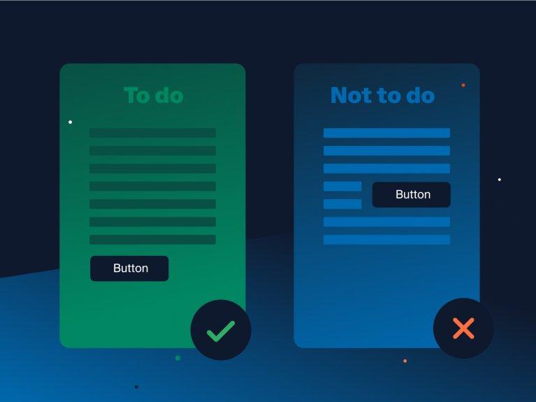
2. Location and Order
Place buttons where users expect them, like at the top or bottom of content units. Also consider that too many buttons in one viewport can be overwhelming. Order matters too, especially when choosing between multiple buttons, like a “save“ and “don’t save” option. In regions where people read left to right, people perceive left as the past and right as the future. The non-destructive options need to be on the right and cancel options on the left. This enhances intuition and recognizes cultural context. According to Soliman, one of our developers and Arabic speaker, the direction of the future may vary by culture. Since he lived in Germany for almost 10 years, he perceives right as the future, but he knows a lot of people who see it the other way around. So the button placement should be based on context, such as reversing the order for Arabic readers.
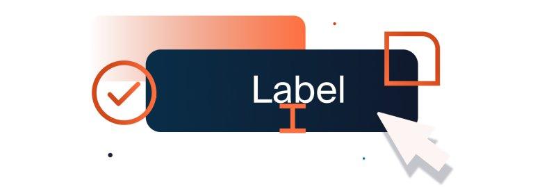
3. Labels and Wording
Labels such as ‘ok’ can be confusing or misleading to users, as they may be expecting a particular action, which may not be what the designer intended. A more precise message needs to be conveyed, using verbs such as ‘send’ and directly describing what happens after someone presses the button. We need to keep it short and to the point, nobody wants or needs a long sentence. The use of icons alone can be powerful but needs to be wisely considered, as we have learned common icons which we identify right away, e.g. a gear wheel for a settings option. But taking an uncommon icon without offering additional text, can lead to misunderstandings.
A short story from my life:
When my grandmother had a new car, she was overwhelmed by the layout of the dashboard.
As we drove, she complained: “I can’t figure out where to set up the time”
After scanning the dashboard, I said: “What does this button do?”
G: “oh I don’t know, I need to read the instructions, we’d better not press it!”.
Not the wisest thing to tell your grandchild in the first place, so I thought: ‘if it was going to set the car on fire, they would have labelled it differently’. And at the risk of messing something up, I pulled myself together in my excitement and decided to… just push it! My grandmother gasped for breath, but — et voilà — the time appeared on the dashboard.
True story and very, very funny at that moment.
So, in hindsight, a decent label would have meant a quicker set-up and less stress for my grandma.
4. Proportions and Hierarchy
Of course, a button should be big enough to be found and clicked on, but small enough not to distract from the content. Size, shape, colour and contrast allow us to prioritise and establish the hierarchy of buttons. Most important buttons, such as the CTA (Call-to-action), should stand out from the rest.
5. Interactional Feedback
A button is a multi-state object and providing visual or auditory feedback to users when interacting with it, should be a top priority. Micro-interactions as well as hover and focus states should always be part of the design process. If there is no feedback at all, it is automatically interpreted as an error and is more likely not to be pressed. Users may think: “My action had no effect at all. I got no feedback on what went wrong. So what do I do now?” Each state needs its own design to indicate what’s going on.
According to Evgen, one of our frontend developers, button behaviours like hover and focus states are necessary interactions. He prioritises and enjoys implementing them and creates concepts for these states if needed and if not already defined by the designers.
“Hover and Focus States are a must for me. If they’re not available, I develop them myself.”
6. Accessibility
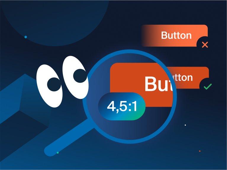
With all these guidelines, we must not forget about visual impairment. Contrast and colour compositions need to be chosen wisely and should meet the requirements of the Web Content Accessibility Guidelines (WCAG). This ensures that the website is visually accessible to everyone. The contrast ratio of at least 4.5:1 is a good benchmark. A good way to check this is by using tools like the Colour Contrast Analyser (CCA) or sites like total’s colour filter. Hover states and interaction feedback will also help to improve visibility. The same is true of hidden labels interpreted by screen readers. These are preferred by non-sighted users.
Helpful Guidelines
There are explicit guidelines for software such as iOS or Android, as well as adaptable systems of guidelines such as Google’s Material Design (material.io), which shares components, tools and best practices for user interface design. This not only provides in-depth knowledge, but also helps to improve your own workflow.
Don’t push my buttons!
Let’s talk about the dark side of user interface design and button design for a moment, and how it can lead to frustration and unwanted performance. Our actions in the physical world and on interfaces are guided by learned behaviours and patterns. Colours like green and red are universally associated with ‘go’ and ‘stop’ respectively. So it makes sense to use red for potentially destructive actions, like a ‘delete’ button, to warn the user.
However, some companies may use their design to steer the user in a particular direction to achieve their agenda. As mentioned earlier with the left and right placement of buttons or the intuitive use of icons. If we’re already inclined to act a certain way, it’s easy to be manipulated. For example, the button to buy a product on the website would be much more prominent in size and colour than the ‘cancel’ button, which might just be a text button next to it.
Cookie banners on the other hand often prioritise the ‘accept all’ option over ‘decline’ or ‘preferences’. Sometimes there isn’t even a decline option or it is very hidden in the preferences, which can lead to users simply accepting all, as they tend to go with the fastest, more convenient way. Whenever I come across a new website, I like to take screenshots of the cookie banner, as I find the variety of approaches taken with this issue most interesting.
User Interface Design vs. Development
By the time we define all the button styles and behaviours on the interface, the designers have to work closely with the developers. The best user interface design is worth nothing if it can’t be implemented in the front end. And sometimes the system is against us and we have to make compromises in our design. In this case it is always best to go back to basics and don’t experience too much.
There can be vivid and endless discussions about how, where, where exactly, really like this, or maybe one pixel more space and why is it this colour? But is there now a perfect button design? No. Because it is not a question of ‘is it perfect?’ but of ‘is it right?’. There is no good button design without a concept. It should first and foremost follow the style guide of the brand or product and adjust to the context it is used in. We need to remember that the look and feel of a button conveys the character of the brand. While some may want to look expensive and like technology leaders like Apple, others may want to look affordable like Amazon and use bright colours and bold lettering. Following the best practices above, is a great start to get you to the right look.
Is there a perfect button design?
The answer is, No. Because it is not a question of ‘is it perfect?’ but of ‘is it right?’. There is no good button design without a concept. It should first and foremost follow the style guide of the brand or product and adjust to the context it is used in. We need to remember that the look and feel of a button conveys the character of the brand. While some may want to look expensive and like technology leaders like Apple, others may want to look affordable like Amazon and use bright colours and bold lettering. Following the best practices above, is a great start to get you to the right look.
Why buttons are fun
A button is an element full of possibility that brings any user interface to life.
It’s all about the variety of actions. Like any interactive object, we have actions and reactions. It’s the excitement of what will happen when we engage with it. What will happen when we press it? We achieve something with a simple touch. Adding fun animations can make it even more entertaining. It’s a kind of positive reinforcement — do what the interface asks for and you’ll get something out of it. It is as simple as that.
Let’s button up
So although it may seem like a small, trivial element at first, that little thing has a trunkful of tricks and is essential to any well-designed user interface. And most of all it’s your friend. It supports you, guides you and enjoys interacting with you. Using a button should feel good and right. Which is why so many things have to be considered and decided up front. It is not easy, but it is so worth it, as in my humble opinion, a great button experience is the key to a successful web application that everyone wants to use. But maybe I’m just a big fan of these cool little things. How about you?
